Your Budget Now Shows the Whole Year. The Old Page Is Gone.
 Dennis Vymer
Last week, at the bottom of the post, I wrote six words: budgeting is due a proper pass.
It got one. And by Sunday evening the old budget page was not hidden behind a setting or tucked into a menu. It was deleted. If you opened Budgeting this morning and thought "wait, where did my month go", that was me.
The month page is now the year page
The old page showed one month at a time. Fine, until you ask a normal question: is this September actually bad, or is it just the month the car insurance landed? Answering meant clicking back through eight months and holding them in your head.
Now the top of the page is the whole year on one chart. Each month is a bar split into needs and wants, with a green bar next to it for what you invested, and your savings rate printed under every month. A dashed line runs across at your average spending, so the expensive months stick out on their own. Months still ahead show your plan as an outline.
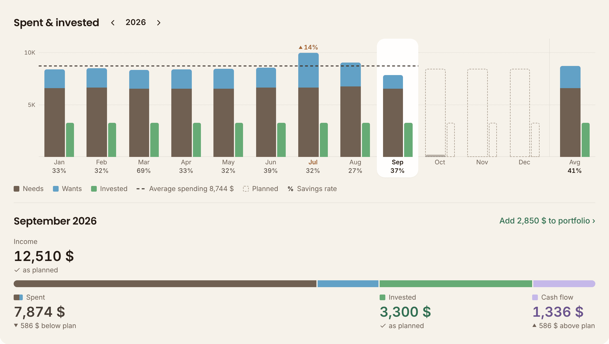
Under the chart sits the month you picked, as one bar: what came in, what you spent, what you invested, what was left. Small thing, but it bugged me for days: the four numbers used to sit in equal columns that ignored the bar, so in the demo's September "Invested" stood right under the brown spending slice. Now every figure starts exactly where its own slice starts. Your eyes stop doing arithmetic.
A few things came in with it that I have wanted for a long time:
- Yearly and quarterly bills get spread. An insurance payment that covers the next three or twelve months now counts across those months, instead of making one month look like a disaster. The bank transaction stays whole; the budget just stops panicking.
- Investing from the budget. When a month shows money went to investments, there is a link that turns it into a dated purchase in your portfolio in two taps, at that day's price.
- Foreign currency, handled properly. A payment in euros on a koruna budget is converted at that day's rate, and the original amount stays visible. If there is no rate, it gets flagged and left out, never quietly counted one-to-one.
To try it: Budgeting in the sidebar, then click any month on the chart. Or poke at it without an account in the live demo.
Net worth that looks like it is growing
On Saturday I shipped a new "Net worth over time" chart: a staircase, past years as steps, the current year broken into months. On Monday I replaced it. Clever, hard to read, and a mess on a phone.
The new version is just a line going up through every balance you ever recorded, with the area underneath split into cash, liquid investments and property. A dotted line carries on into the future at your projected growth rate, over a hatched band so nobody mistakes it for money they already have. Your next round milestone sits on the chart as a dashed line. Below it, one chip per year with how much you grew, and the months broken down by what moved.
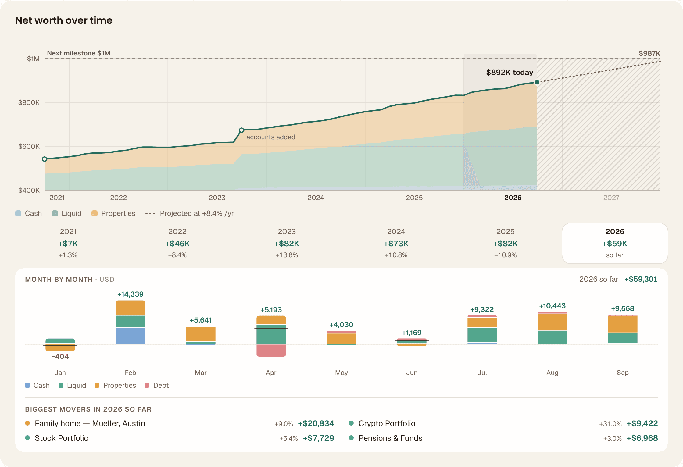
The "biggest movers" list at the bottom has one rule I like: an account you just added is never ranked. Otherwise its whole balance tops the list and you learn nothing. Net Worth page, or the demo.
Smaller, but they matter
The portfolio page opens with one card now: what it is worth, what you made, and a bar showing what it is made of. And I found something embarrassing on the way. Someone with 75 holdings was seeing their totals and dividends calculated from only their 50 largest. Every holding now counts, up to 150.
Last week I said broker statements that mix currencies were top of the list. Fixed: a 7.50 koruna fee on a euro trade was being booked as 7.50 euros, and on some sells the profit column was being read as a fee. Both gone.
Someone asked me to track one Brazilian fund. The app now knows about 1,400 of them. And the whole app looks calmer now: warmer colours, no gradients.
What I am on next
The part of FIRE nobody builds tools for: living off the money. Which holdings to sell, and when, inside the retirement paycheck view. After that, a heatmap of your holdings so you can see who did the heavy lifting this year. The Android app is still in progress. Dividend tax I promised to stop mentioning, and look at me, keeping a promise.
The lesson this week was about the old page. The new budgeting sat behind an on/off switch while I tested it. The demo had it switched on. Signed-in accounts, it turned out, never did. So for a while the demo was a better product than the real thing, and I had no idea. I didn't flip the switch, I deleted it, along with the old page. Two versions of a screen means one of them is always the one you forgot to check.
One version now. Go break it, and tell me where.
Stay updated
Get notified when we publish new articles.
Ready to apply this?
Start tracking your finances today and put these tips into practice.
- Import bank statements in seconds
- AI-powered categorization
- Beautiful visualizations
- Set and track financial goals
Related posts

Your Funds Don't Tell You What You Own. Now Your Net Worth Page Does.
Your net worth page has a new tile that looks through your funds and pensions and tells you which regions, sectors and currencies your money is actually riding on, crypto got a Profit & taxes tab with an exchange-export import, and the free calculators now lead with the answer instead of hiding it.

Tell the App Your Target Mix. It Tells You What to Buy This Month.
There's a fourth tab on the portfolio page that takes the split you want and tells you what to buy this month in whole shares, net worth finally has a place for the car and the private shares, and reordering your accounts works on a phone.

MFFT Learned Pounds and Rand. One Long Fund Name Nearly Stopped It.
The UK tax year starts on 6 April and MFFT finally knows it, South African rand stopped reading as a hundred times too much, and your uninvested cash now has exactly one place to live instead of two.